
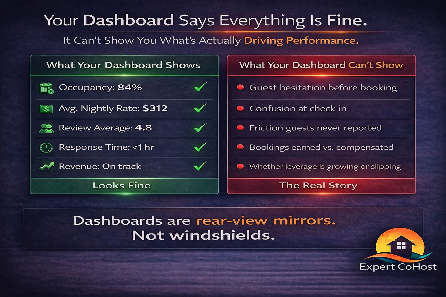
Airbnb performance dashboards feel authoritative.
They show:
-
occupancy
-
average nightly rate
-
revenue
-
booking lead time
-
review averages
-
response time
Everything looks measurable. Trackable. Under control.
And yet, many listings plateau with dashboards that look perfectly reasonable.
That’s because Airbnb dashboards show results — not position. They reflect what already happened, not whether your listing is gaining or losing leverage.
Dashboards Show Outcomes — Not Causes
Dashboards are built to answer:
“What happened?”
They are not built to answer:
“Why did it happen?”
A listing can show:
-
solid occupancy
-
stable revenue
-
respectable ratings
while still:
-
losing pricing power
-
slipping in relative visibility
-
attracting less aligned guests
-
experiencing slower momentum
The dashboard won’t tell you that directly.
Because uplift isn’t a line item.
The Most Important Drivers Are Invisible
Before performance shifts in the numbers, it shifts in the experience.
Dashboards don’t measure:
-
guest hesitation before booking
-
confidence when comparing listings
-
clarity of arrival instructions
-
emotional tone of communication
-
small friction points that never become complaints
Guests rarely announce dissatisfaction. They internalize it.
And internalized friction shows up later — as softer reviews, lower conversion, and reduced pricing tolerance.
By the time you see it on a dashboard, the cause is already old.
Why Dashboards Lag Reality
Consider how performance actually unfolds:
-
Guest experience today →
-
Review tomorrow →
-
Visibility next week →
-
Booking velocity next month →
-
Revenue next quarter
Dashboards live at the end of that chain.
They confirm trends after they’ve already taken hold.
That’s why reacting to dashboards alone often feels like chasing the past.
The Illusion of “Good” Metrics
Some of the most misleading scenarios look like this:
-
High occupancy masking weaker ADR
-
Stable revenue hiding higher turnover and stress
-
Decent ratings concealing loss of enthusiasm
-
Fast response times masking generic communication
Each metric looks acceptable.
But acceptable in a winner-take-most market is fragile.
The system rewards listings that feel safer, clearer, and more reliable — and dashboards don’t quantify how a guest felt.
Portfolio Dashboards Hide Property-Level Drift
At scale, the problem compounds.
Portfolio dashboards average everything:
-
strong properties offset weaker ones
-
occupancy smooths out
-
revenue appears stable
From a management perspective, nothing looks urgent.
From an owner’s perspective, the property may feel:
-
busy but brittle
-
stable but stagnant
-
active but not compounding
Dashboards don’t reveal relative position — only raw output.
Uplift Doesn’t Have a Column
There is no dashboard column for:
-
guest confidence
-
pricing resilience
-
forgiveness margin
-
conversion advantage
-
algorithmic trust
But those forces determine everything.
When uplift strengthens:
-
bookings happen earlier
-
pricing holds firmer
-
reviews grow more enthusiastic
-
demand compounds
When uplift weakens:
-
adjustments increase
-
pricing becomes sensitive
-
guest friction grows
-
performance plateaus
Dashboards show the symptoms — not the leverage.
What Owners Should Be Watching Instead
Beyond dashboards, owners should pay attention to:
-
Are guests asking fewer clarifying questions?
-
Do bookings happen confidently at target rates?
-
Are reviews enthusiastic — or just polite?
-
Does pricing feel stable or constantly adjusted?
-
Does the property feel calm — or reactive?
These are leading indicators of uplift.
Dashboards are trailing indicators.
How Dashboards Should Be Used
Dashboards are useful — when used correctly.
They should:
-
confirm trends
-
validate improvements
-
measure the impact of changes
They should not:
-
diagnose root causes
-
replace experience review
-
substitute for strategic oversight
Data is powerful when paired with interpretation.
Alone, it’s just numbers.
Final Thought
Airbnb performance dashboards tell you what already happened.
They don’t tell you whether your listing is gaining leverage — or quietly losing it.
In a winner-take-most marketplace, that distinction matters more than any single metric.
Because performance isn’t built in spreadsheets.
It’s built in the experience that spreadsheets can’t see.